Coastal House Design / Architecture 101: Colour basics
Sunshine Coast architecture is there a definitive Sunshine Coast style of housing or unique local vernacular design? I guess not the closest thing to that would probably be to a certain extent -the ubiquitous single skin, skillion roof fibro beach shack, although not entirely native to the area it certainly is prevalent here and nowadays the modern day houses here are mostly just permutations of the same early coastal logic.
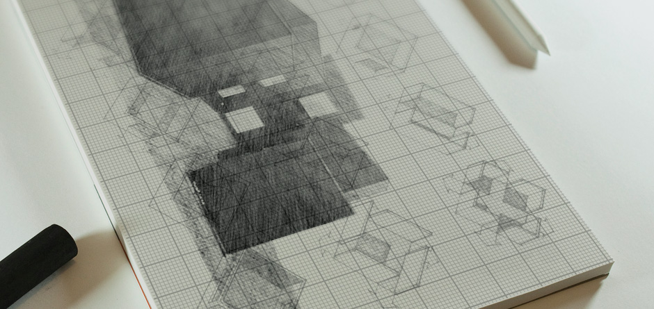
One house in Noosa however does not conform to this stereotype at all – a Mock Tudor mansion located on Mitti Street in Noosa‘s prestigious Little Cove precinct, approximately 200 m from the ocean sits an alien artefact with a steep pitched roof. This house has always offended me and also kind of amused me at the same time, especially on really hot summer days when I’ve parked nearby to visit the beach, it sits awkwardly in its surroundings dug into the side of a hill, like an uninvited guest dressed in a rented brown tuxedo at a pool party seemingly transplanted from another bygone era, a giant gingerbread house movie set for an imaginary cookie commercial (pictured bellow).
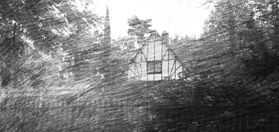
The severely steep roof of this caricature-ish home (pictured above) is seemingly designed one can only assume to keep snow off or perhaps fallout in a nuclear winter, complete with twin brick chimney stacks and also ‘Mock Tudor’ half timbering and stucco panelling , in traditional brown and white reminiscent of the 1880’s Tudor revival period. It feels so out of place down to the tiny little fixed lead panel windows no doubt to keep the snow and the cold air out in a harsh European winter, there is seemingly no kind of deck or connection to outdoor space or cross ventilation for that matter as though copied directly out of a child’s fairytale book and somehow magically transplanted to the current day shores of the sunshine coast without any consideration for the time or place in which it was constructed, designed in a vacuum by an elderly woman on a rocking chair in the 17th century. I feel it’s a perfect metaphor for poorly conceived coastal architecture and building design in general.
When designing your house on the coast it is important not just to cut and paste ideas from the pages of your children story books or the latest designer home magazines for that matter, an example in recent times is the popularization of ‘big black box architecture’ in South East Queensland is no doubt partly in response to exposure to websites such as Architecture Australia or Dezeen which are both consistently filled with beautiful minimalist houses which resemble giant black cubes and while this is all well and good in cold climates, it simply does not work in Queenslands sub tropical climate. Painting something black and leaving it exposed to sunlight is basic colour theory 101 they teach you in 1st year of architecture school, you try to avoid direct northern solar exposure to large expanses of black cladding otherwise you’ve designed a massive passive solar heater, designed to attract sunshine. The use of colour is very important some people desire the aesthetic of pure black box exterior without understanding the repercussions of such a decision. A black box while looking visually stunning would quickly be regretted in the peak of summer on the Sunshine Coast facing a black surface of your home directly north or west is a terrible idea as the sun will quickly convert your contemporary box into a sauna, great if building a Trombe wall but not so good for a living room or bedroom design on the coast.
The amazing black cubist boxes you see popularized on the covers of pretentious designer housing magazines and on websites are generally conceived with this logic in mind to deal with colder climates such as Europe, New Zealand or even southern states of Australia -places where having a black box and creating your own private greenhouse/sauna is actually an advantageous decision, but the mild winters of the subtropics and harsh summers of the sunshine coast this is not ideal, shelters which attract heat do not bode well with this sub tropical coastal climate. I am not saying do not paint anything black but at least consider where would be appropriate in your home, there is nothing stopping you from having a giant black coloured southern façade which will get little direct sun exposure.
Caveat: I painted the entire exterior of my own house black. It is an exception to the rule haha! or perhaps just plain hypocritical.
The house is a long thin rectangle which runs along an east to west axis. The main facade is orientated perfectly north and therefore the sun can easily be controlled using passive shading strategies for max winter sun penetration and minimal solar exposure in summer. There are strategically placed battens along the north which block the harsh summer sun and there is also solar panels running the entire north section of roof which acts as yet another buffer from the sun. The house including ceiling and walls has been insulated well and the west elevation is protected by a giant mango tree as is the east.
So the act of painting it black might not seem so well thought out but it was.
THE SCIENCE OF WHITE
The use of white or light colours on the outer surface of a building generally reflect heat more efficiently than other colours, choosing a white substraight is a well-known method architects and building designers employ to improve a roofs performance. White is the most effective colour for limiting the temperature of a roof surface, however it is absorptivity for solar radiation is slightly higher than that of bright metal such as s/steel or raw galvanised zincalume. Probably the greatest advantage of the white coloured surfaces is evident at night when its high emissivity enables it to cool far more rapidly than other similar shiny surfaced materials.
Frequently clients desire a stark white minimalist interior; aside from this looking frigid and hostile like the backdrop of an Apple Computer ad or a hospital surgical ward, there is also the issue of glare, while it is true that clean white walls offer light and also often seemingly increases the size of the room visually and psychologically, there are downsides to a pure white aesthetic. I have visited houses so intent on white-ness and visual gentrification they’ve even invested in white television sets (complete with white remotes), white furnishings, white carpet and variuos other white over-kill appliances and designer inclusions, it kind of gives you an uneasy feeling in the pit of your stomach as you enter such a space as though visiting the den of a serial killer, conjuring chilling images in my mind of these clean white walls bathed in your impending blood spatter.
White can be your friend however, especially if offset with warmer additions such as wood paneling or other timber features such as timber window reveals, frames, timber batten screens there are a million tints of white too so just be careful when vaguely specifying to your builder “paint it white” there is for example there are in dulux alone a myriad of different whites and as you can see they differ greatly.
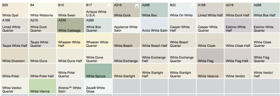
Choose your whites wisely even when painting a test patch paint a decent size test patch of say 1m x 1m not just a quick dip of the brush and a little smere. I recently heard a story from a local builder about one client who chose a particular colour without even painting a test patch, simply selecting the colour at a quick glance then and there in the store without very much consideration simply going off a tiny paint swatch sample on tiny bit of cardboard, this client then proceeded to signed off on the entire house to be basically covered from skirting to ceiling in this particular shade of what she assumed was a light green, she went away on holidays during the renovation and the entire structure was painted in her absence, when the client returned for a site visit excited to see the progress of her project she was dumbstruck when she entered the site “what the hell kind of colour is this? it looks like baby shit green, it’s awful!” the painter was devastated with her response as he’d just finished the final coat, the builder gave the owner the paint sample swatch she’d chosen and sure enough it was the same color, it looked inoffensive at such a small scale but as a whole house horrendous this was a costly mistake as I believe it ended up adding another 6-7 thousand dollars to the cost of the renovation to rectify, so bare that in mind when flicking through samples at super sonic speed and remember to choose wisely.

Door for Christian Dior by Bureau Betak
Another major drawback of white home designs and lighter coloured finishes such as whitewashes is longevity, they do not commonly retain their reflective abilities or low absorptive properties as when they are brand new or as tested in laboratory conditions and therefore their true values can never be accurately determined. Dust, dirt in the atmosphere and other detritus such a bird droppings can build up over time and greatly dull the surface and diminish the effectiveness of a white reflective surface. This in turn requires frequent home cleaning or painting of surfaces to maintain maximum reflectivity and performance, an often uneconomical and daunting proposition. Another disadvantage of light colours on a steel sheet pitch roof (especially bright white & stainless steel sheeting is that they can create a glare issues for neighbouring houses and also adjacent lower rooms of the same house if positioned without proper consideration.
PSYCHOLOGICAL EFFECTS OF COLOUR IN ARCHITECTURAL APPLICATIONS
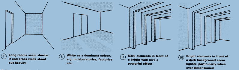
Colours have a power over humans, they can create feelings of wellbeing, unease, hyperactivity or passivity, for instance. Colouring in factories, offices or schools can enhance or reduce performance: in hospitals it can reportledly have a positive influence on patients’ health. This influence works indirectly through making rooms appear wider or narrower, thereby giving an impression of space, which promotes a feeling of restriction or freedom. It also works directly through the physical reactions or impulses evoked by the individual colours.
IMPULSE COLOURS
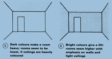
The strongest impulse effect comes from orange; then follow yellow, red, green, and purple. The weakest impulse effect comes from blue, greeny blue and violet (i.e. cold and passive colours). Strong impulse colours are suitable only for small areas in a house. Conversely, low impulse colours can be used for larger areas in houses. Warm colours have an active and stimulating effect, which in certain circumstances can be exciting. Cold colours have a passive effect – calming and spiritual. Green causes nervous tension. The effects produced by colour also depend on brightness and location it is suggested for areas such as the sunshine coast to choose lighter shades for exteriors and perhaps darker tints for more intimate interior spaces within your home. Warm and bright colours viewed overhead have a spiritually stimulating effect; viewed from the side, a warming, drawing closer effect; and. seen below. a lightening, elevating effect.
WARM COLOURED HOUSES ‘VS’ DARK COLOURED HOME DESIGNS ON THE COAST
Warm and dark colours viewed above are enclosing or dignified; seen from the side, embracing; and, seen below, suggest safe to grip and to tread on. Cold and bright colours above brighten a home up and can be relaxing; from the side they seem to lead away; and, seen below, look smooth and stimulating for walking on. Cold and dark colours are threatening when above; cold and sad from the side; and burdensome, dragging down, when below. White is the colour of total purity, cleanliness and order. White plays a leading role in the colour design of rooms an homes in general, breaking up and neutralising other groups of colours, and thereby create an invigorating bright house design. As the colour of order, white is used as the characteristic surface for warehouses and storage places, for road lines and traffic markings.
REFERENCE:
Architects’ Data by Ernst Neufert